Dica 3 Review: A 4G Smartwatch With A Big Screen
Dica 3 is a new line of Apple clone watches, one of the most popular clones on the market. The Dica 3 will also be the best choice for those who want a big-screen 4G smartwatch at a budget-friendly price with all the features of a smartwatch, especially one with long battery life. Let's take a deeper look!

| Dica 3 Features |
| 4G Full Network Connectivity HD Voice |
| 2.0 inches Touch Screen, Always On Display |
| 49mm Rugged Design – Quick Action button |
| 10 Days Battery Life, Wireless Charging |
| Power Saving Mode, Location Sharing |
| Watch Faces, 3 Menu Style |
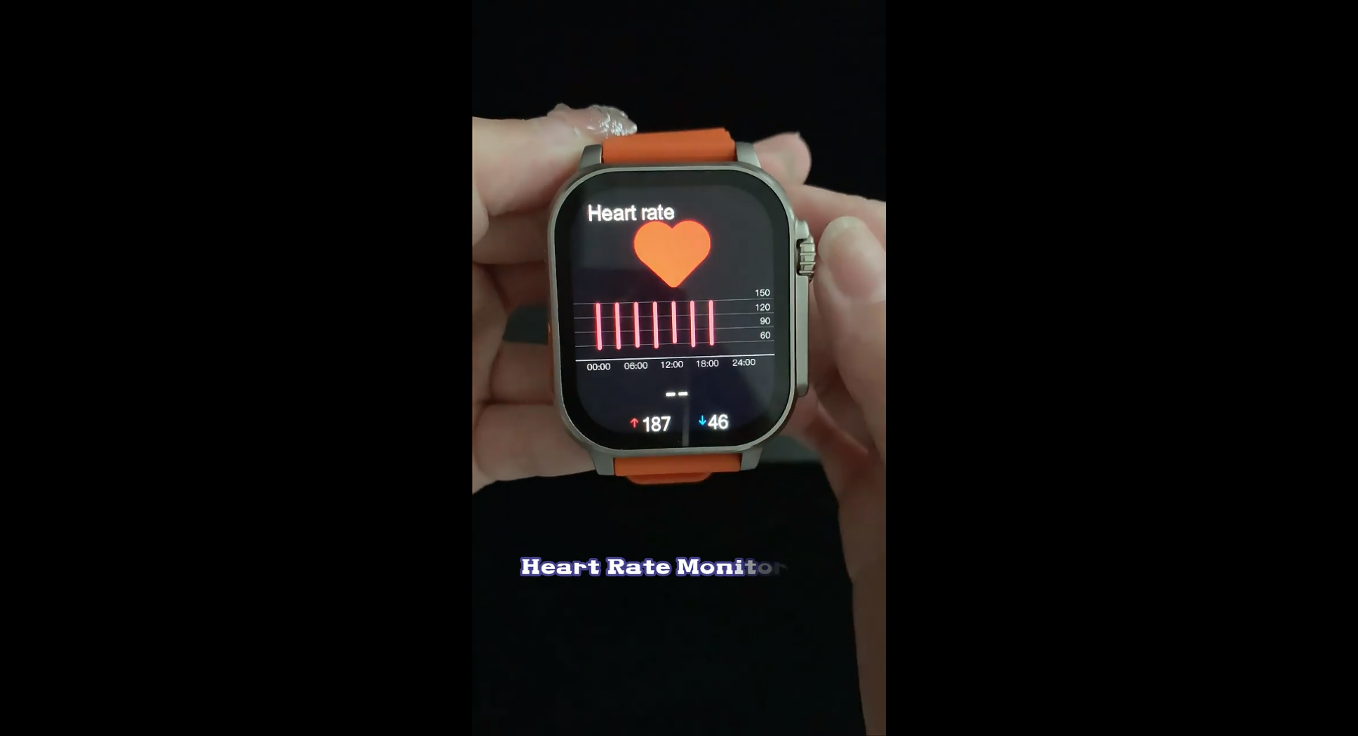
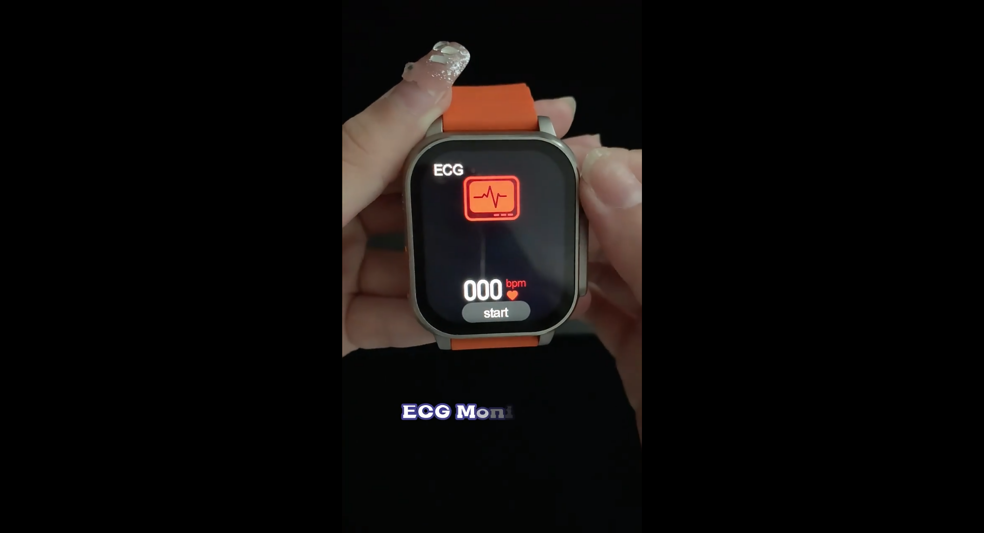
| Heart Rate & Blood Pressure Monitor |
| Wallet Function & Business Cards |
| Voice Assistant |
| Voice Assistant |
Design And Build Quality
The Dica 3 brings a modern and elegant design that makes you want to wear it as an accessory, not to mention its functionality. It's one of the best new smartwatch clones of the Apple Watch. So the shape is square as usual, with a screen size of 2.0 inches and flat sides, rather than 2.5D curved sides like the Series 8 clones. Despite being a budget smartwatch, the Dica 3 feels solid and comfortable, with an elegant look that lends it a high-end feel. The build quality is therefore high, as can be seen through the body, which is slim and light, made of high-quality stainless steel with a matte finish, silver. Perfectly sized with a 49mm 1:1 case, making it the most accurate replica of the original and very comfortable on the wrist. The screen also offers always-on screen dials, which we usually only find in OLED screens, but this time they offer it here despite the technical hurdles (similar but not the same as an always-on display).
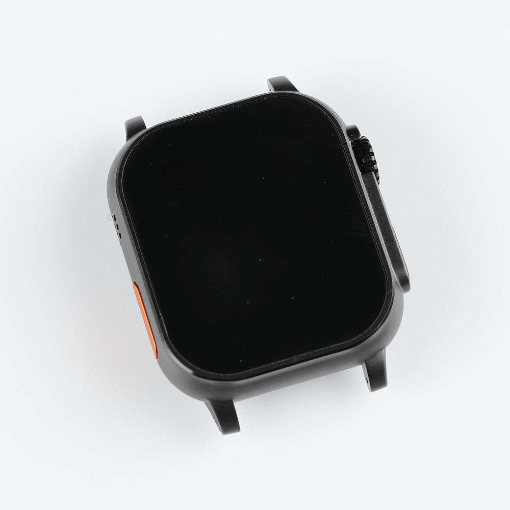
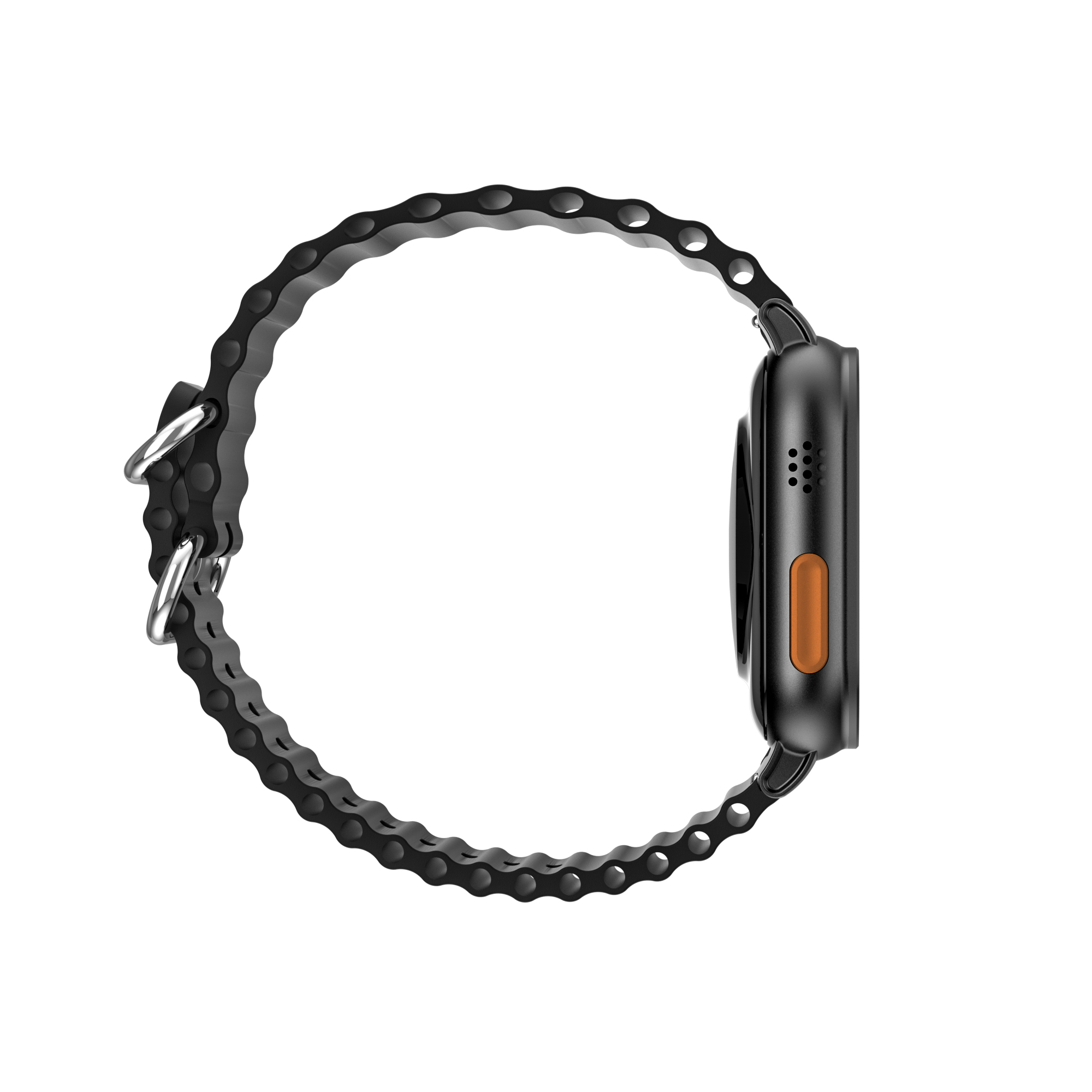
It uses the same combination of crown and side buttons and quick action buttons. That said, the Dica 3's biggest and most meaningful improvements, in my opinion, are the high precision of the display and build and the similarity to the original. This Apple Watch clone has a button on the left side of the case, with a speaker grill and microphone for making calls, as well as a protrusion on the side of the crown and side button.
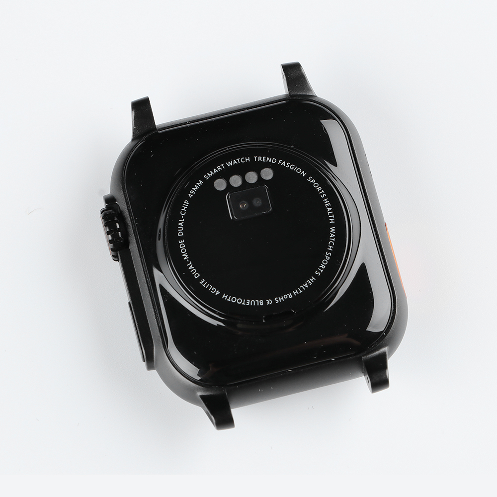
From below there is a sensor that is responsible for all the health and motion functions on the device and as a new gear upgrade, while as usual, there are four contacts on the outside of the metal ring that are responsible for wireless magnetic charging.
The strap is one of the important parts that complete the overall look of the watch, so it is made of silicone, lightweight, and comfortable on the wrist for long-term use. Since it's detachable, you can use any 44/45mm belt and it's available in black and orange. You can also buy another option in metal or leather.

Multiple Menu Styles
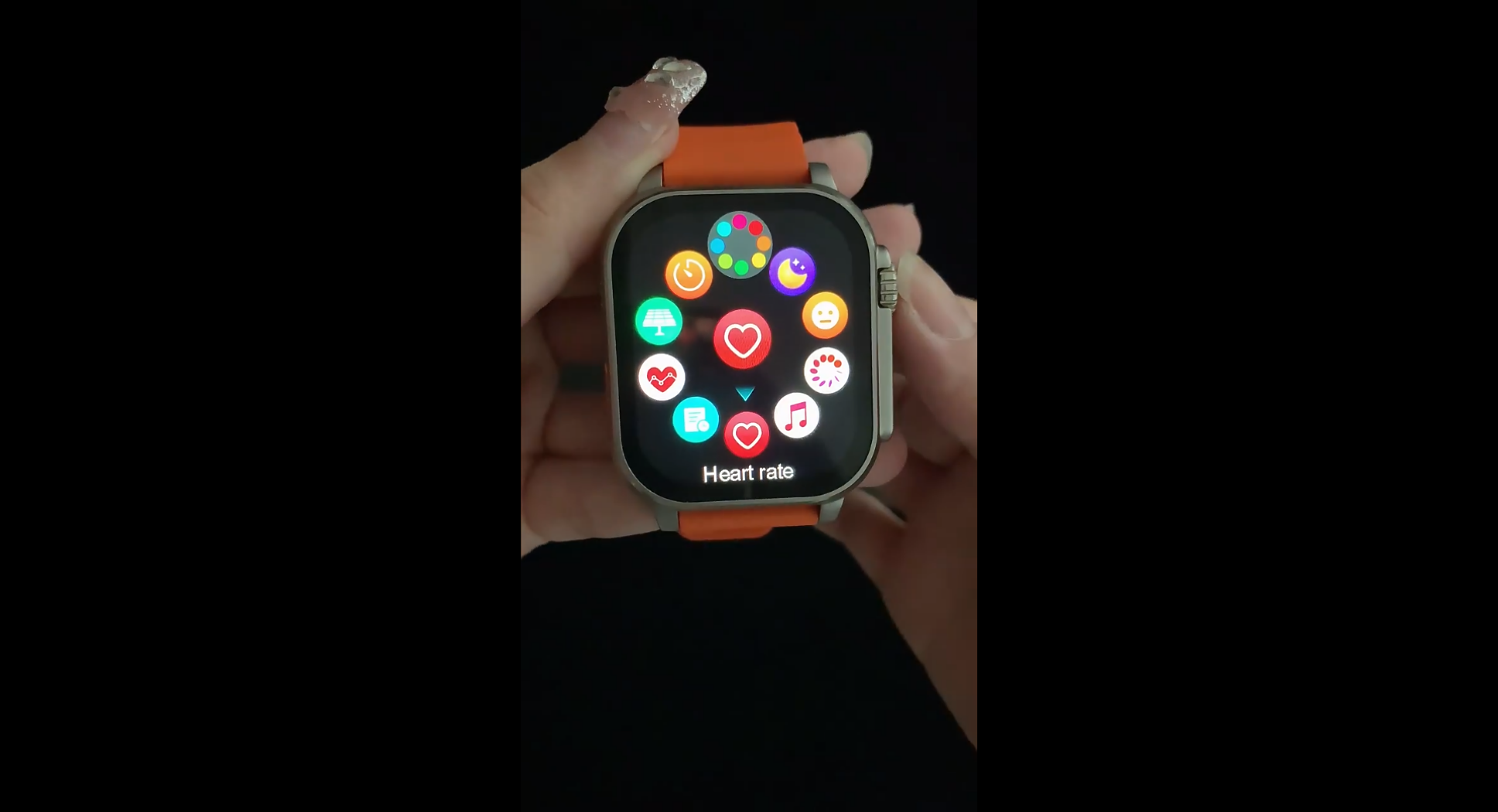
The menu comes with many styles to choose from, just like in the Apple watch series we find Striped six-square grid, list style, and more. Each one allows you to navigate the menu in a different fashion but all of them seem to work just fine. To change the menu style, you only have to double-click the scrolling wheel.
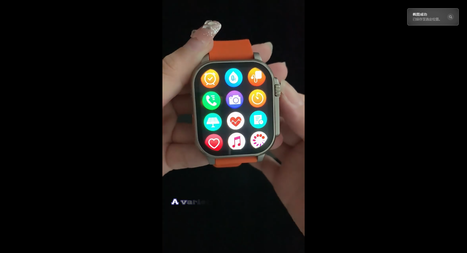
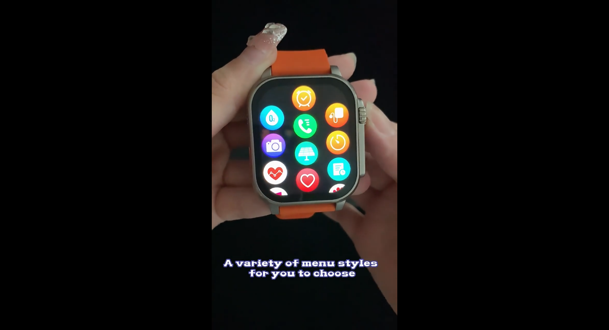
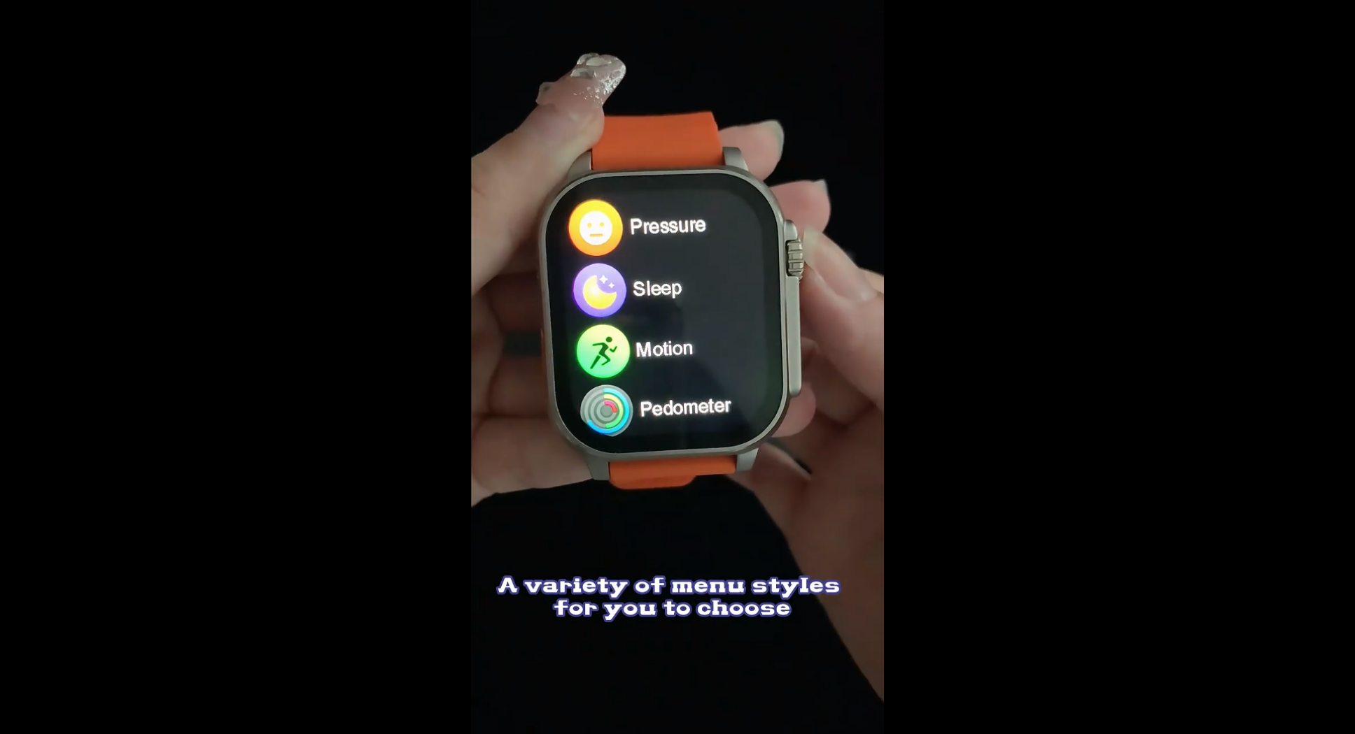
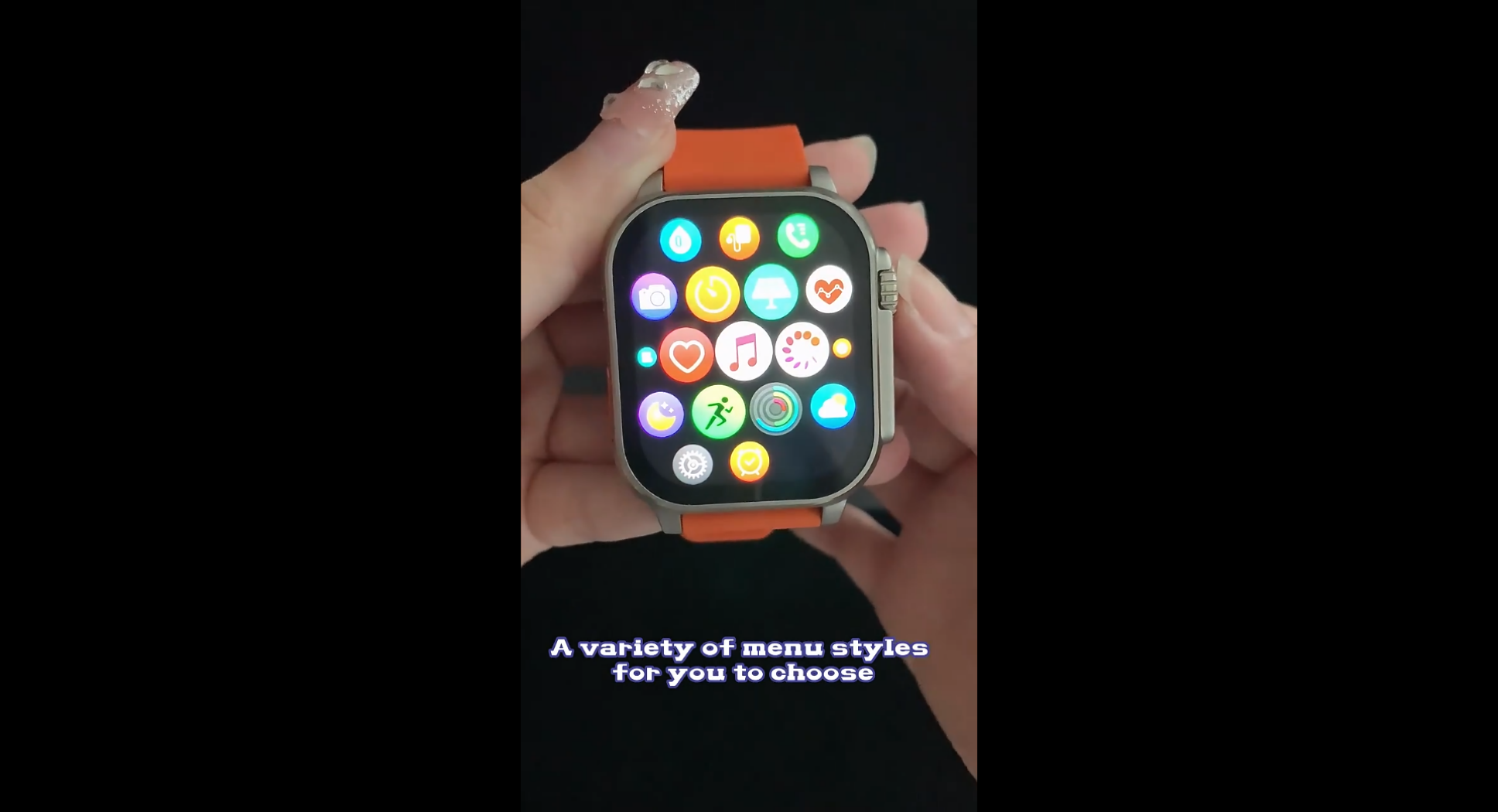
Health Monitoring
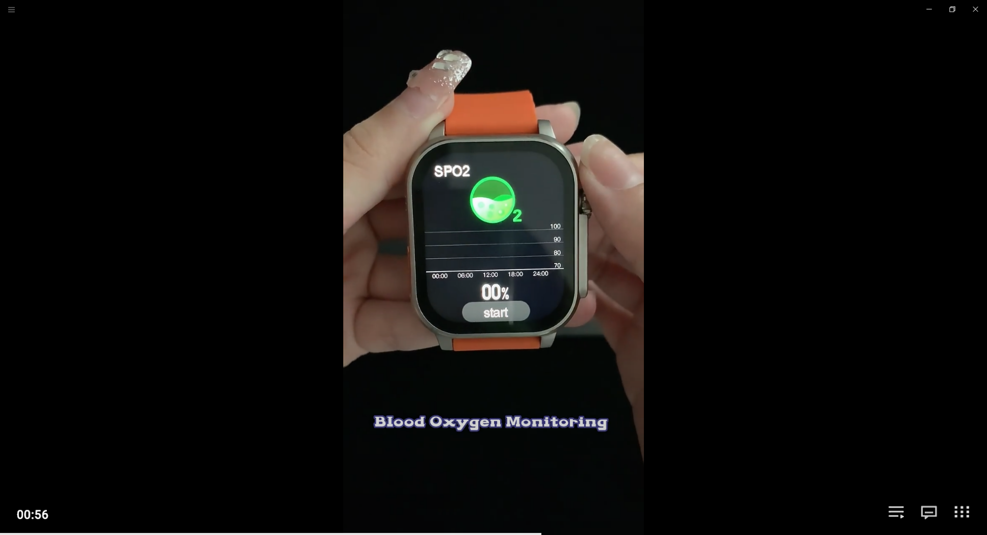
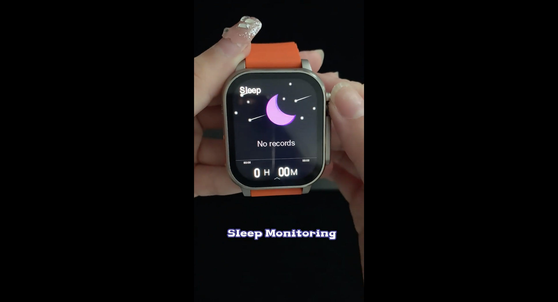
Dica 3 smartwatch features sensors such as heart rate and body temperature, making it one of the best sensors on the market and renowned for providing excellent results. This will help you take better care of your health and encourage you to exercise more.
Waterproof
On the whole, it’s a really good-looking watch and doesn’t feel too obtrusive, thanks to its sleek profile. Having IP67 Waterproof which it means can only handle sweat and splashes of water, although the watch is not approved for swimming but is good for wearing for activities, so, I do not recommend swimming or exposing it to hot water or saltwater to avoid any harm Long or short term and with the presence of a speaker and a microphone, avoiding it will be good, however, if it’s exposed to water in any way, I prefer to dry the watch after immersing it in water and before operating it so that it stays with you for as long as possible.

How Do You Operate The Dica 3
The software is overall a pleasant and rich experience, and it works well enough to allow you to browse and use various applications and functions. One of the most significant updates changes the menus, icons, and general look of the software. Most navigation is done via the touchscreen, where you swipe left, right, up, and down to get to the main parts of the software.
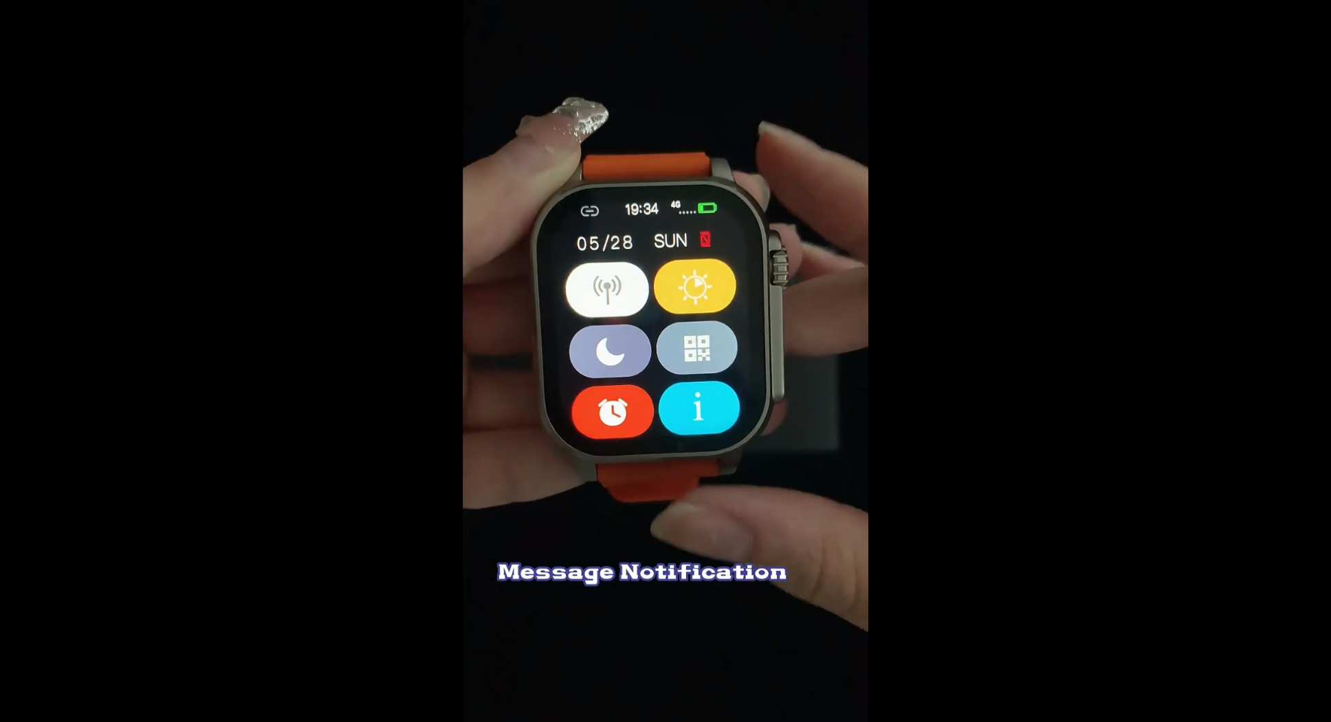
First, after entering, swipe down from the top to access the control center, where you can enable the wallet function and business card, adjust the alarm clock, and control the Douyin short video. It also gives you the battery percentage and sees if your phone is connected to this watch.
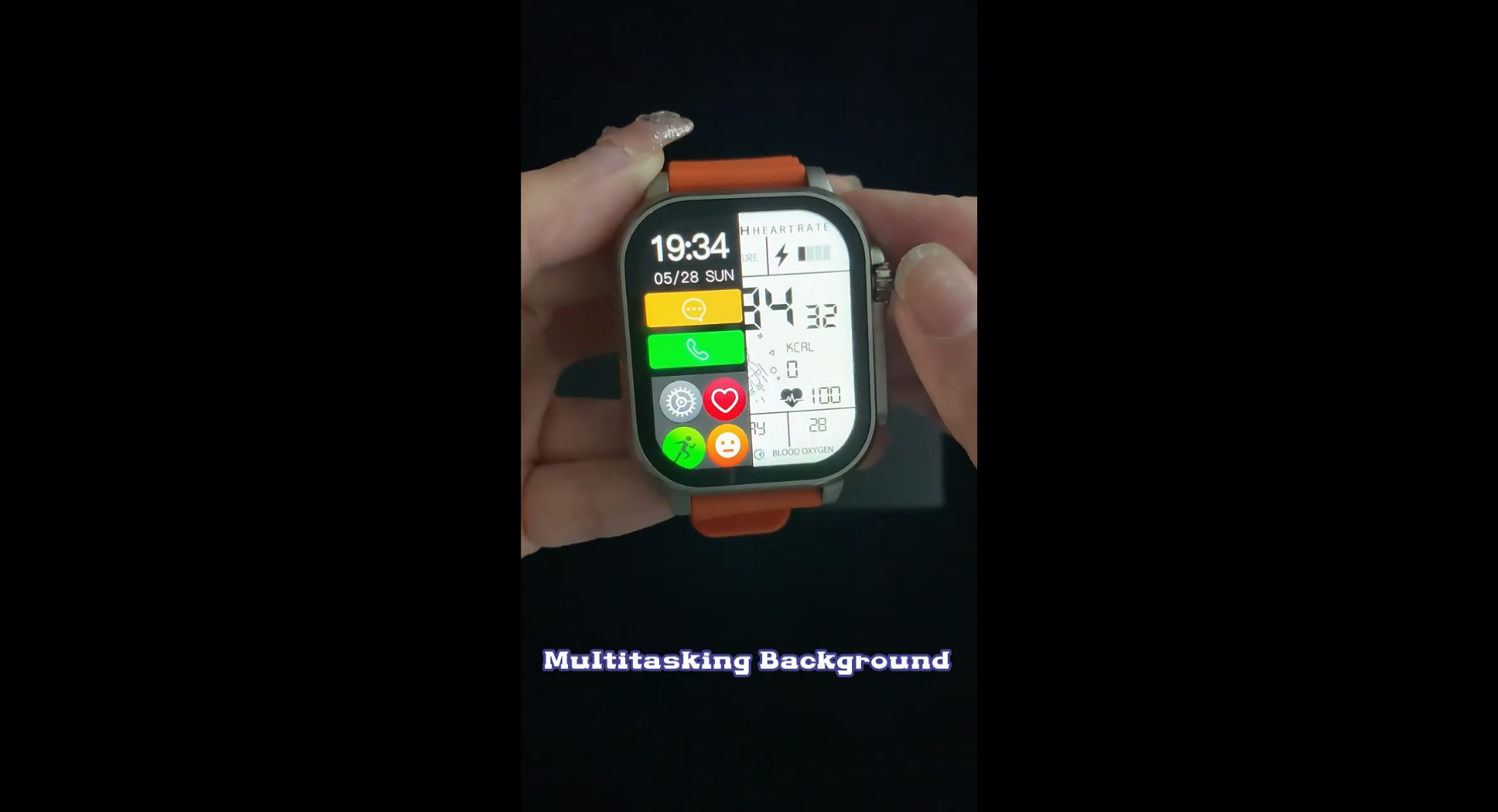
Swipe from the left, and a split window will appear on the side with time, messages, calls, and recent apps.
Double-click the crown button to access the main menu where you'll find heart rate and sleep monitoring, exercise modes, settings, and other features including taking photos from the watch and music, weather, voice assistant, menu styles, app store, phone, and even games and more.


